


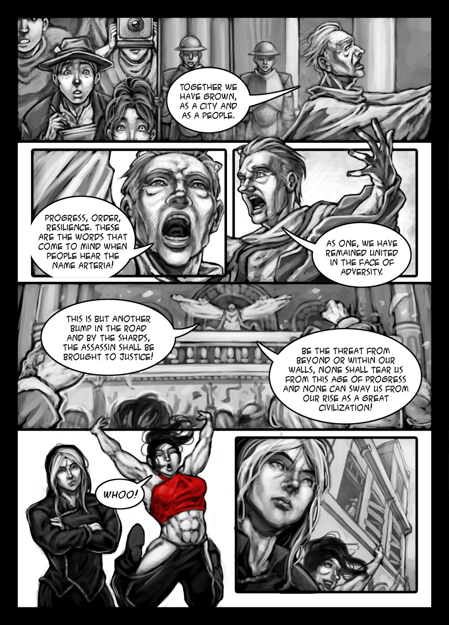
It’s at this point I decided to do away with the spatter effect on the characters. Don’t get me wrong, I still really like how the earliest pages turned out, but it really seemed to work when background was almost minimal with lots of white negative space, so when it came the tavern scene it didn’t quite work out the way I wanted to.
As I experiment and improve on my art, my style tends to evolve organically, so the later pages have taken on a more grayscale tone. The tavern scene was at a weird transitory stage where I was trying to figure out how to make things come together and found that the spatters just got in the way of making the characters stand out. (I feel the art was neither here nor there stylistically as well but hey, I’m learning as I go along)
Hell, even this page is still part of the transitory stage, but it feels a lot less awkward than before. (As I type this I’m actually buffered, so I can compare the most recent page to this one) Not that there might be a stopping point in my style; I’m still experimenting, so who’s to say what it might look like a year from now.
I’m not gonna stop using the spatter brushes entirely however, they are still useful for abstract backgrounds as you can see in the fourth panel.