


Book I. 85
By Humbug | Published October 13, 2014
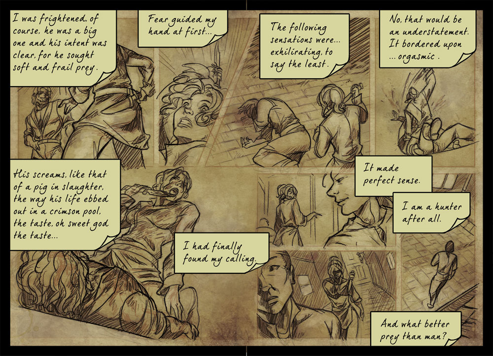
 Urg, I’m really sorry if the text boxes are larger than they should be, I expanded them because I worry the font will be illegible at this size, but it ends up covering more of the panels than it should and makes the flow of the last 3 confusing. Here’s how the actual page looks like. (LINKY)
I’ll probably link the proper image of upcoming journal pages like this because they all pretty much have lots of text and small panels.
 Worst. Date. Ever.